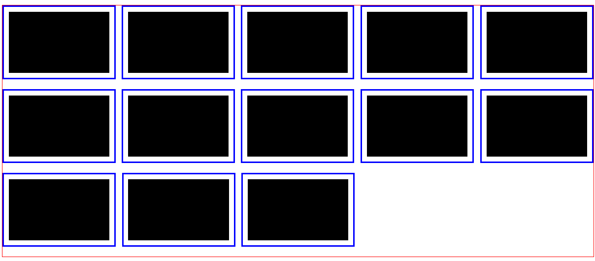
多行弹性布局

实现效果

多行弹性布局效果

实现思路

主要思路是,利用 text-align: justifytext-align-last 两个属性。
前者将除去最后一行的元素进行两端对齐
后者则是对最后一行执行左对齐的样式布局
而后在 利用 css3 选择器,检测到 最后一行的 第一个 item,对齐设置样式后,利用 css2 选择器 从而设置其后面的兄弟元素与其同一个样式

优点

  1. 利用sass,可以任意设置容器宽度,item宽度,两者会最大限度的自适应。自动检测容器中可以放置几个item。(在设置nth-child(4n+1))选择器时需主动书写,sass不可以预处理
  2. 中间间距无需人为主动计算设置

缺点

  1. 需使用预处理语言 sass 或者 less
  2. 不兼容IE浏览器,因其不支持 text-align-last 属性

HTML代码

1
2
3
4
5
6
7
8
9
10
11
12
13
14
15
<ul class="list">
<li class="list-item">cell1</li>
<li class="list-item">cell2</li>
<li class="list-item">cell3</li>
<li class="list-item">cell4</li>
<li class="list-item">cell5</li>
<li class="list-item">cell6</li>
<li class="list-item">cell7</li>
<li class="list-item">cell8</li>
<li class="list-item">cell9</li>
<li class="list-item">cell10</li>
</ul>

scss 代码

1
2
3
4
5
6
7
8
9
10
11
12
13
14
15
16
17
18
19
20
21
22
23
24
25
26
27
28
29
30
31
32
33
34
35
36
37
38
39
40
41
42
43
44
45
46
47
48
49
50
51
52
53
54
55
56
57
58
59
60
61
62
63
64
65
66
67
68
69
70
71
72
73
74
75
76
77
78
79
80
// 重置样式
* {
margin: 0;
padding: 0;
}

li {
list-style-type: none;
}

// 所需宏
@mixin justify($font-size: 0) {
text-align: justify;
text-justify: distribute-all-lines;
text-align-last: left;
-moz-text-align-last: left;
-webkit-text-align-last: left;
font-size: $font-size;
}

// 容器宽度
$container-width: 1200px;

// 单元宽度
$item-width: 230px;

// 一行显示 多少个 单元
// 1. 计算最多 可以承载数量
$temp-length: $container-width / $item-width;
// 2. 向下取整
$number: floor($temp-length);


// 为了计算 单元间的横向间隔而做的辅助计算
// $space-width: ($container-width - $item-width * $number) / ($number - 1)
// 1. 所有单元 总宽
$sum-item-width: $number * $item-width;
// 2. 间隔总宽
$sum-space-width: $container-width - $sum-item-width;
// 3. 间隔总数目
$sum-space-length: $number - 1;
// 4. 两个单元间隔横向间距
$space-width: $sum-space-width / $sum-space-length;


.list {
width: $container-width;
margin: 0 auto;
border: 1px solid red;
@include justify();
.list-item {
display: inline-block;
width: $item-width;
height: 150px;
border: 3px solid blue;
padding: 10px;
background: #000;
background-origin: content-box;
background-clip: content-box;
box-sizing: border-box;

margin-bottom: 20px;
}

.list-item:nth-child(5n+1):nth-last-child(2),
.list-item:nth-child(5n+1):nth-last-child(2) + .list-item {
// background: red;
margin-right: $space-width;
margin-bottom: 0;
}

.list-item:nth-child(5n+1):nth-last-child(3),
.list-item:nth-child(5n+1):nth-last-child(3) + .list-item {
// background: red;
margin-right: $space-width;
margin-bottom: 0;
}

}